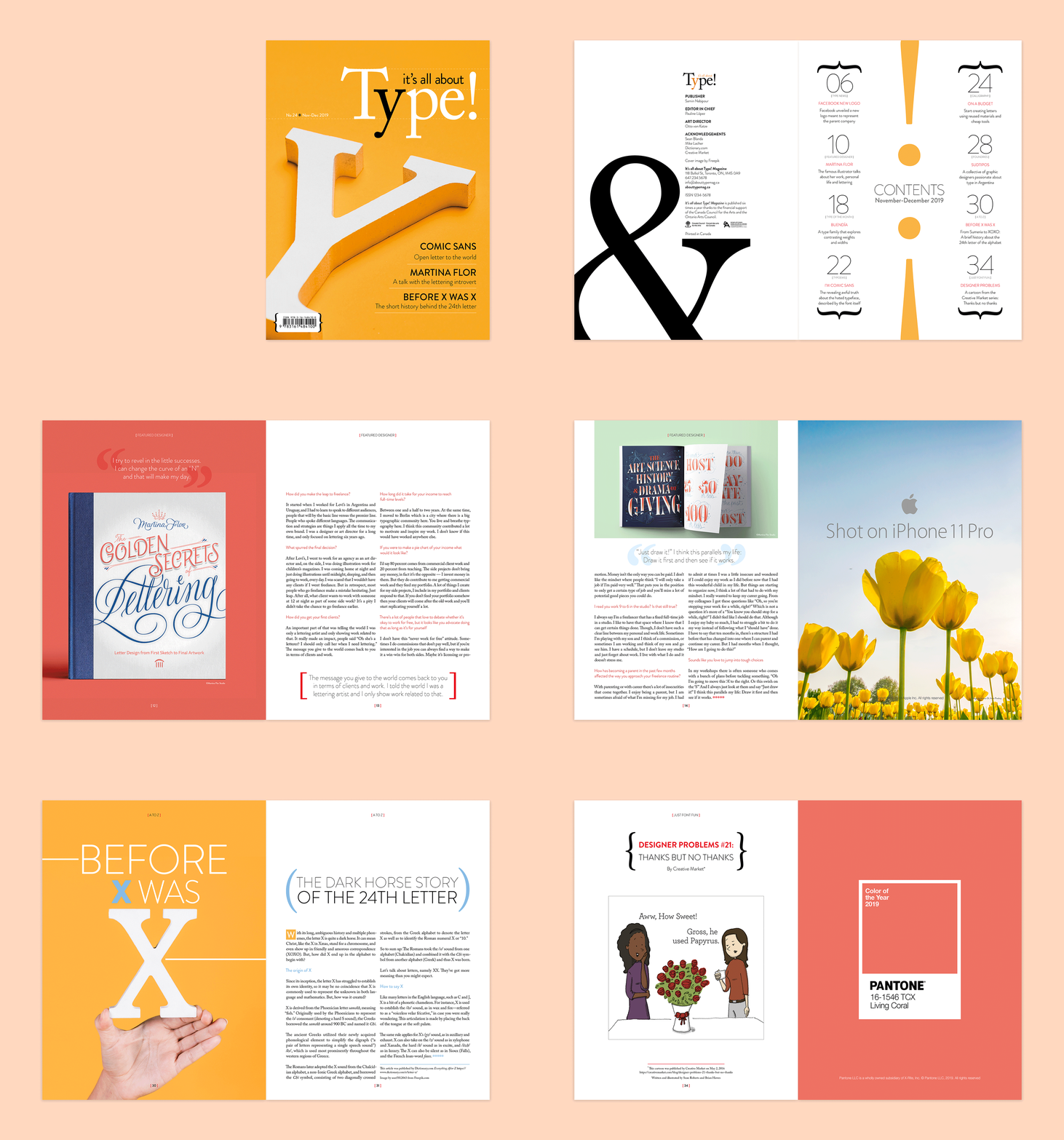
It’s all about type! | Magazine concept
This is a prototype of what my ideal magazine about typography would look like. I was inspired by the shapes of some glyphs and symbols and the possibilities of using them as graphic elements. I also wanted to use the contrast between typefaces to create interesting compositions. All contents come from online articles, and the ads were designed to mimic the real ones from Apple, Pantone and Penguin Random House.
| Cover design, layout design and typesetting, photo-editing, ad design |

